A billion-dollar revenue stream gated by journeys users cannot navigate. We mapped the friction and priced the fix.
LinkedIn's Sales Solutions business, which includes Sales Navigator, generates over $1 billion in annual revenue — one of the company's key streams alongside talent, marketing, and premium subscriptions.
The essential user journeys inside it are flawed. Not broken in a way that shows up in a bug report, but degraded in a way that caps how much of the product a customer ever reaches.
That matters more than a usability score. Premium memberships churn with individual job needs; company contracts do not. If Sales Navigator becomes operationally load-bearing for a sales organisation, it stops being a subscription anyone cancels.
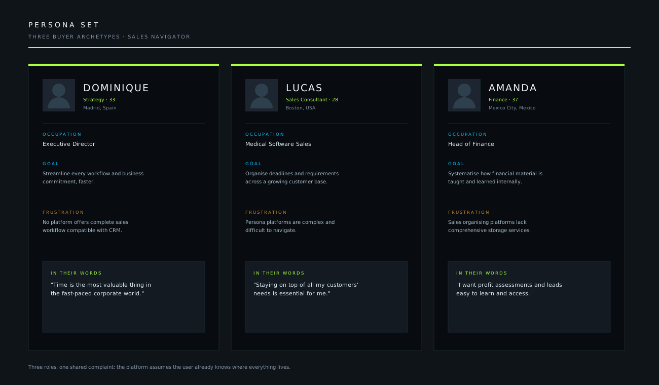
A strategy director in Madrid, a medical software rep in Boston, a finance lead in Mexico City. Different jobs, different income bands, different reasons for opening the product — and a shared frustration that the platform assumes you already know where everything lives.
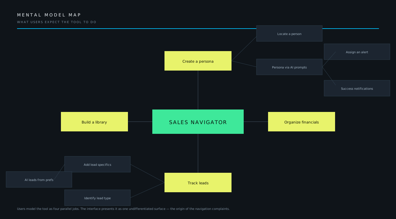
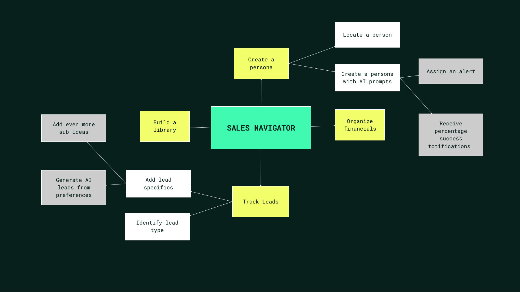
We ran a cognitive walkthrough from each friction point and mapped the model users carry into the product. They expect four parallel jobs: build a library, create a persona, track leads, organise financials.
The interface presents one undifferentiated surface. That mismatch is the origin of every navigation complaint in the research.
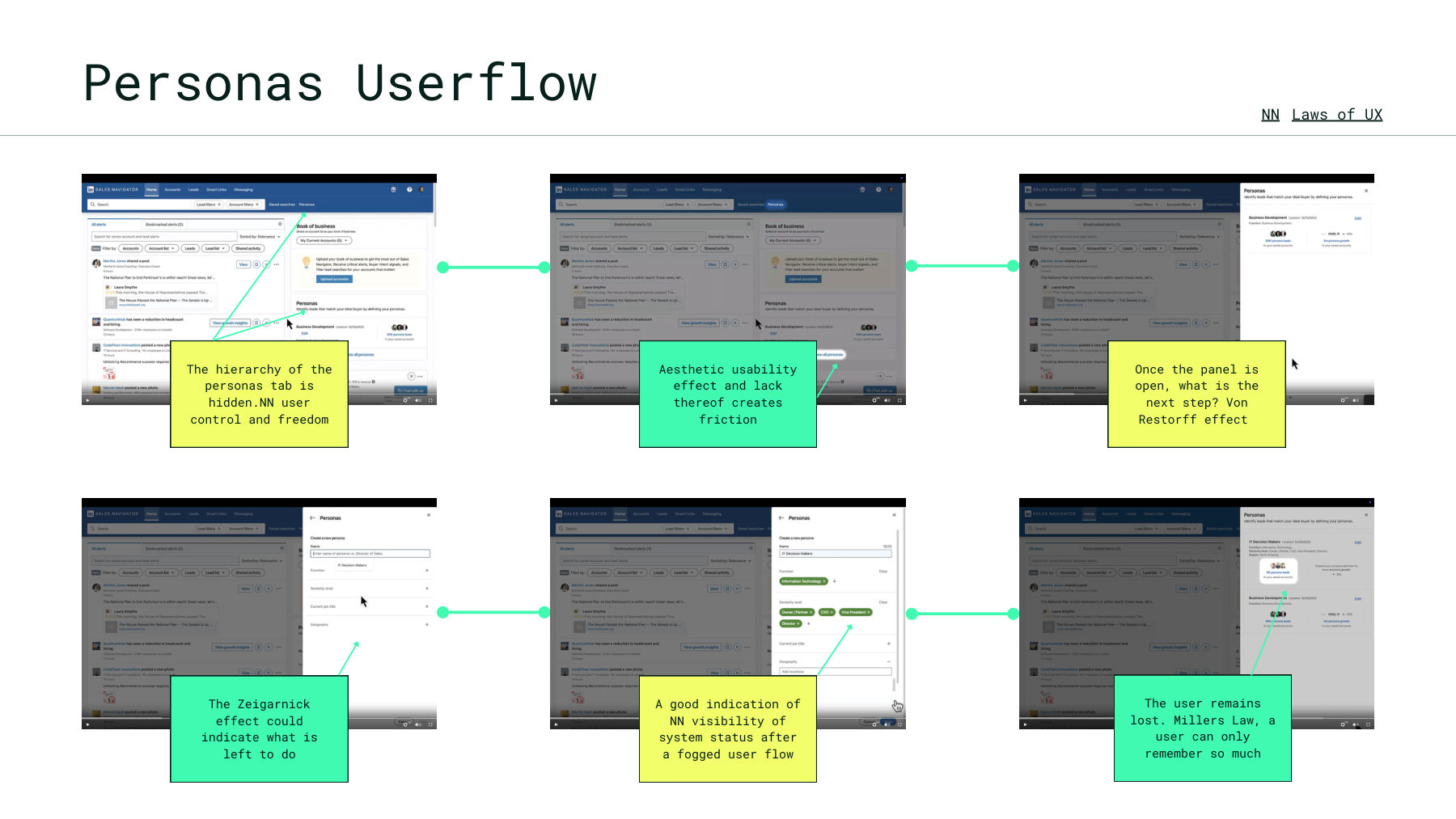
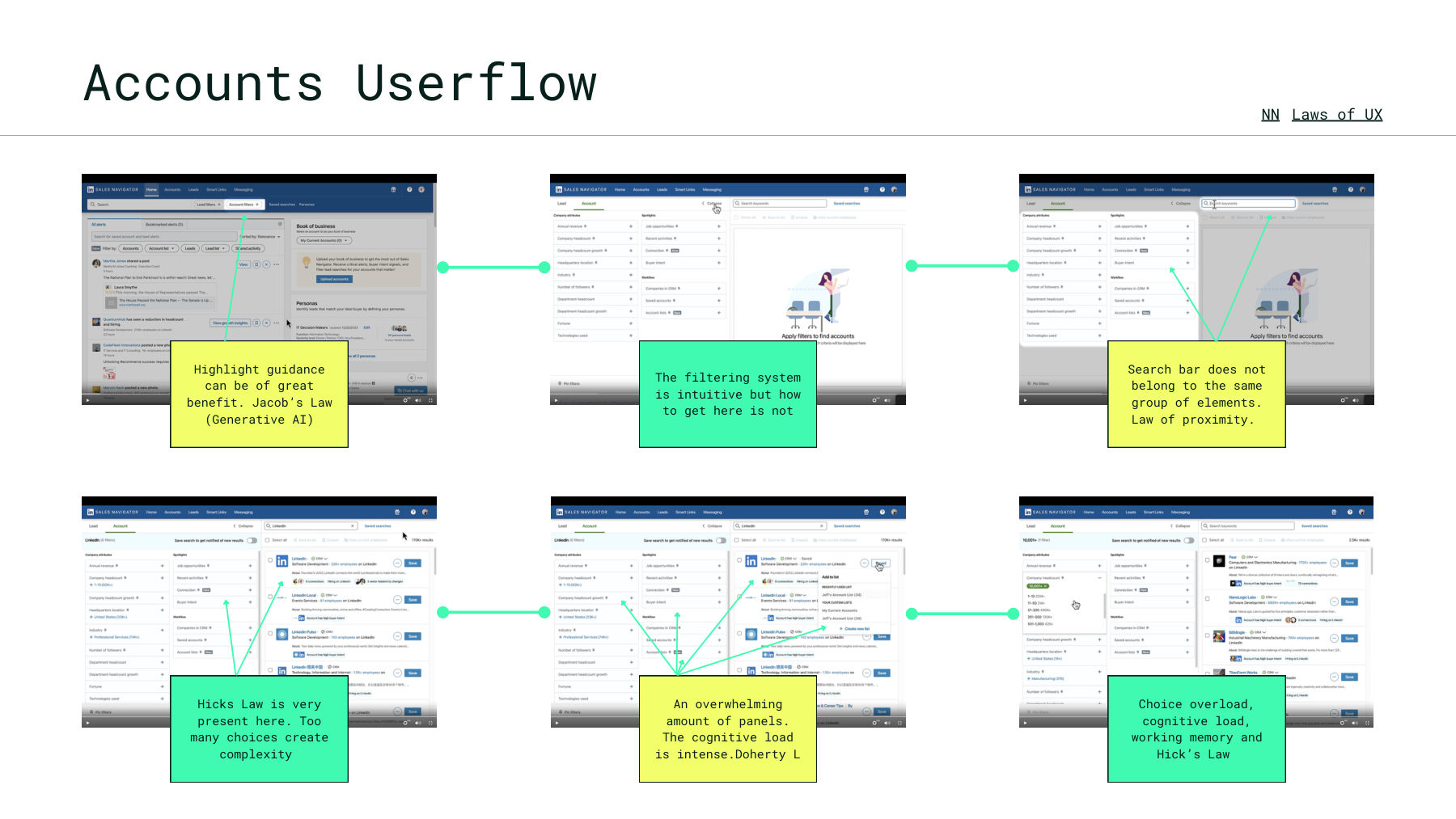
We walked the Personas and Accounts flows screen by screen, annotating each break against Nielsen Norman heuristics and the Laws of UX. Naming the principle matters — it turns a complaint into a specification an engineer can act on.
The entry point to personas is buried, violating user control and freedom. Users cannot act on a capability they cannot locate — and this is the feature most directly tied to the product's value proposition.
The panel opens and offers no signal about what to do next. Without a Von Restorff contrast to anchor attention, the user stalls at the moment they were ready to act.
Miller's Law caps how much a user can hold at once. The flow asks them to carry more state than working memory allows, so they lose their place even when every individual screen is well-formed.
Hick's Law is acute here. The filtering system is intuitive once reached, but the volume of simultaneous panels makes reaching it an exercise in elimination rather than selection.
The search bar is visually separated from the elements it controls, breaking the Law of Proximity. Users look for it where it logically belongs and do not find it there.
The density of simultaneous panels pushes processing cost past the point where the interface feels responsive to thought — the product feels slow even when it is fast.
Persona profiles, the mental model map, and the screen-by-screen userflow audits annotated against Nielsen Norman heuristics and the Laws of UX.
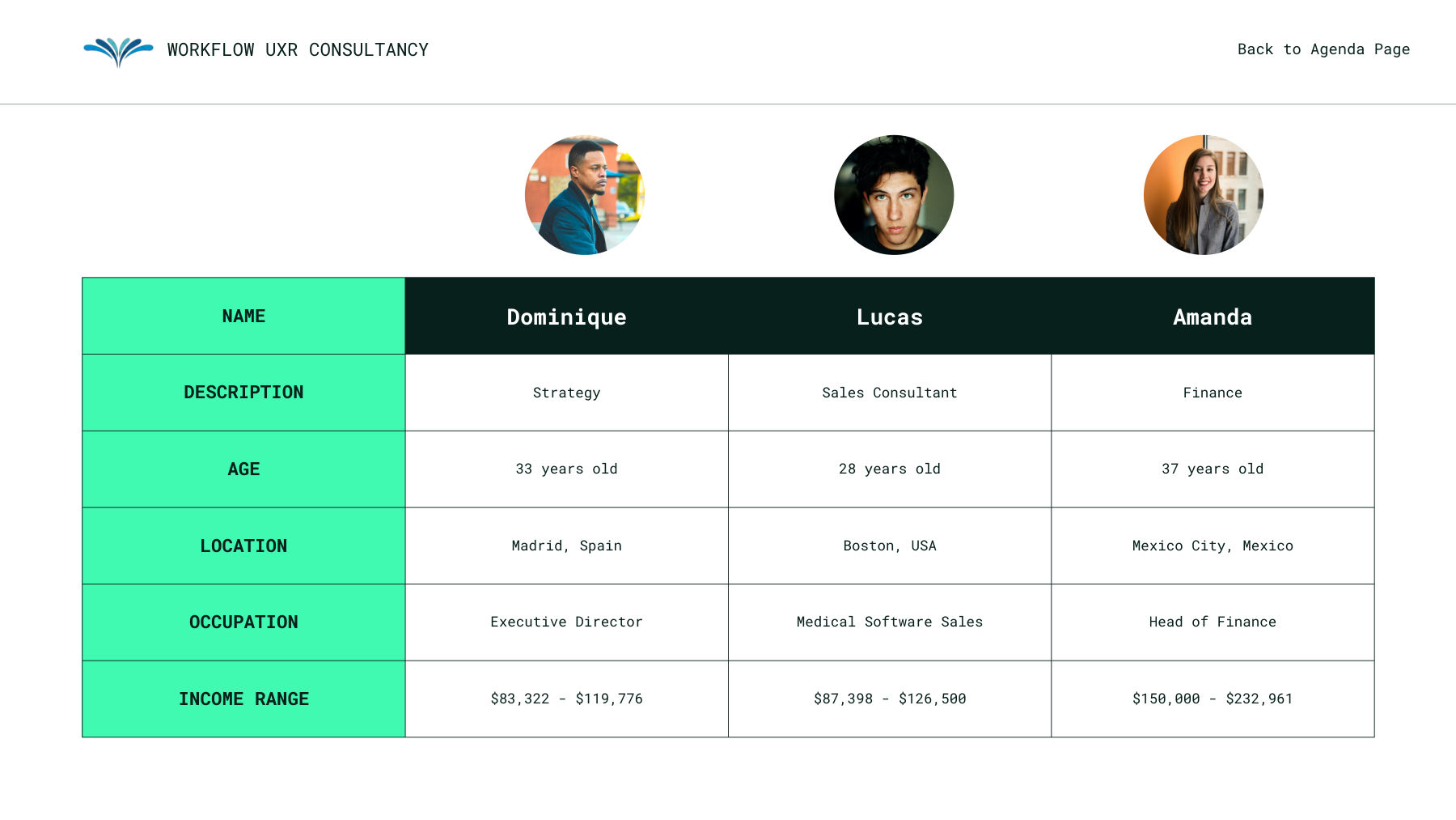
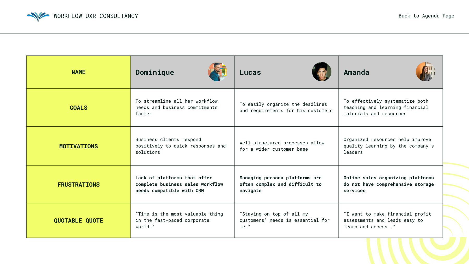
The recorded walkthrough — persona set, the mental model gap, each annotated friction point, and the revenue case for sequencing.
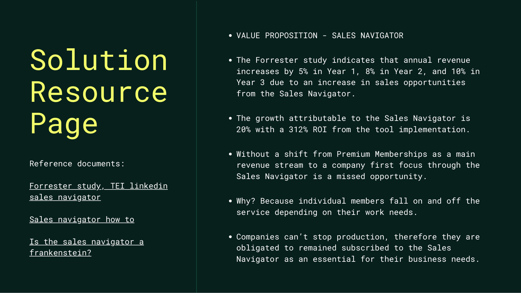
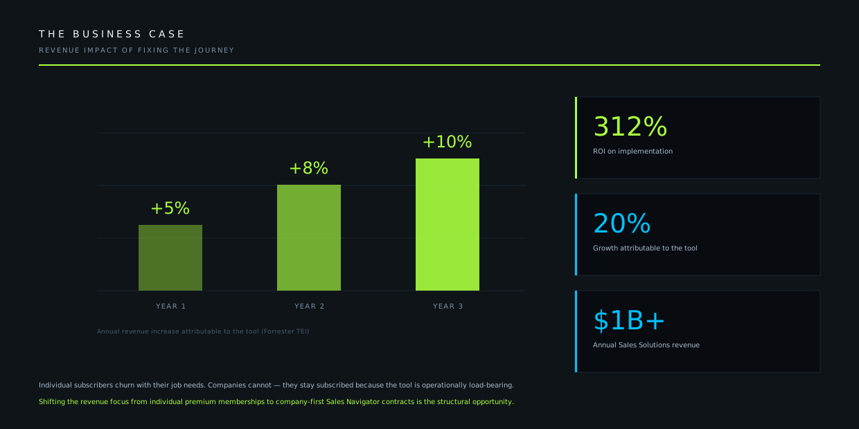
Forrester's Total Economic Impact study puts annual revenue increase attributable to Sales Navigator at 5% in year one, 8% in year two, and 10% in year three, with a 312% ROI on implementation.
Those returns are gated by adoption. A seat that is hard to navigate is a seat that goes unused, and an unused seat is the one a procurement review cuts first.
The sequencing is the deliverable. Fixing these in the wrong order means spending engineering effort on friction that users would have tolerated.
Identify which user journeys carry the most revenue consequence and address those first within Sales Navigator.
Build out mental models with a cognitive walkthrough from each friction point already identified.
Tree testing and a full heuristics analysis to confirm the architecture matches how users actually search.
Design, usability test, iterate to MVP — then monitor for pitfalls the research did not anticipate.